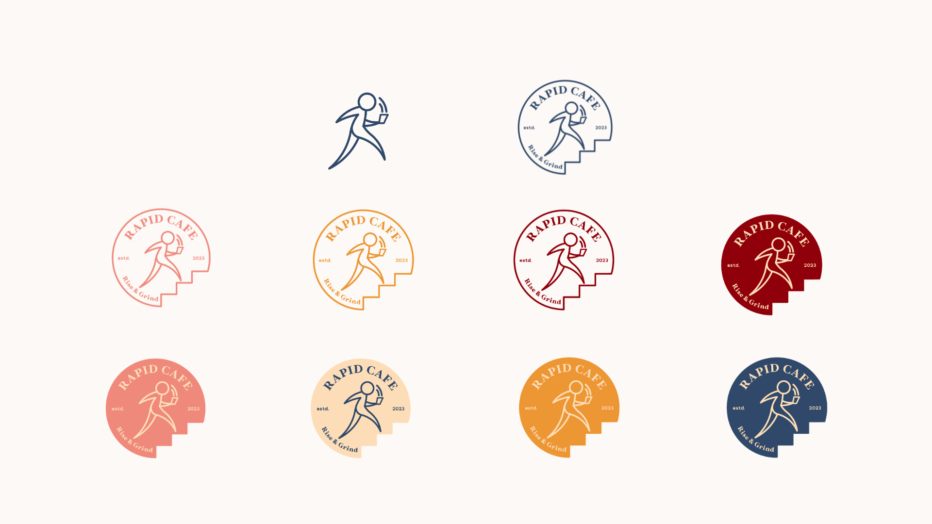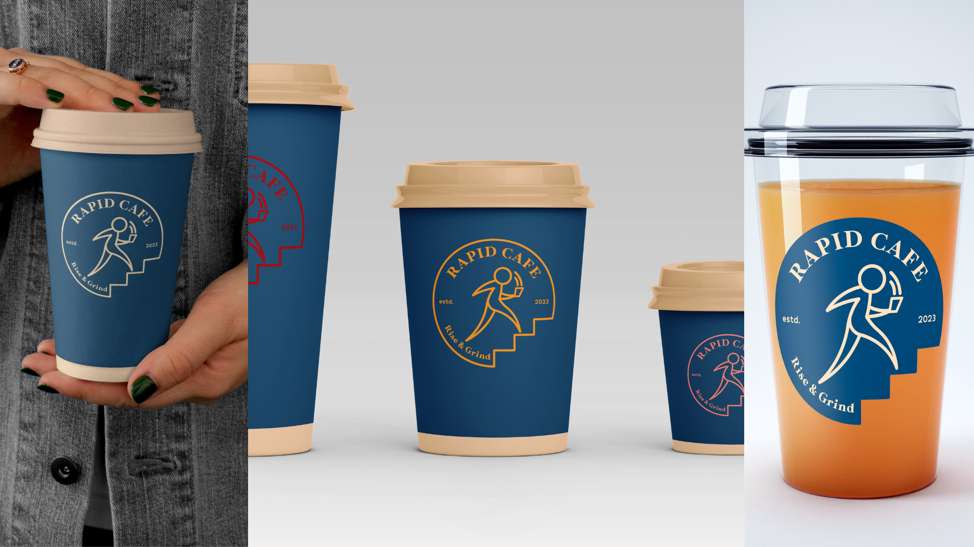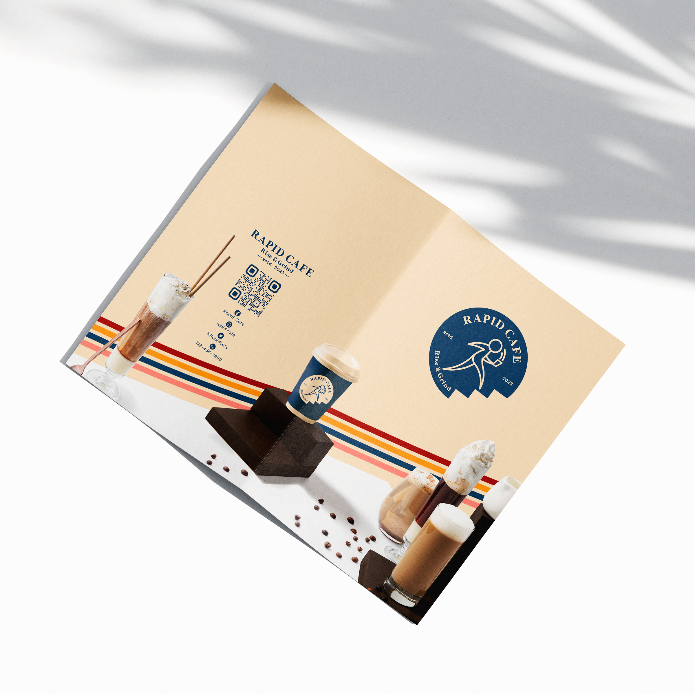
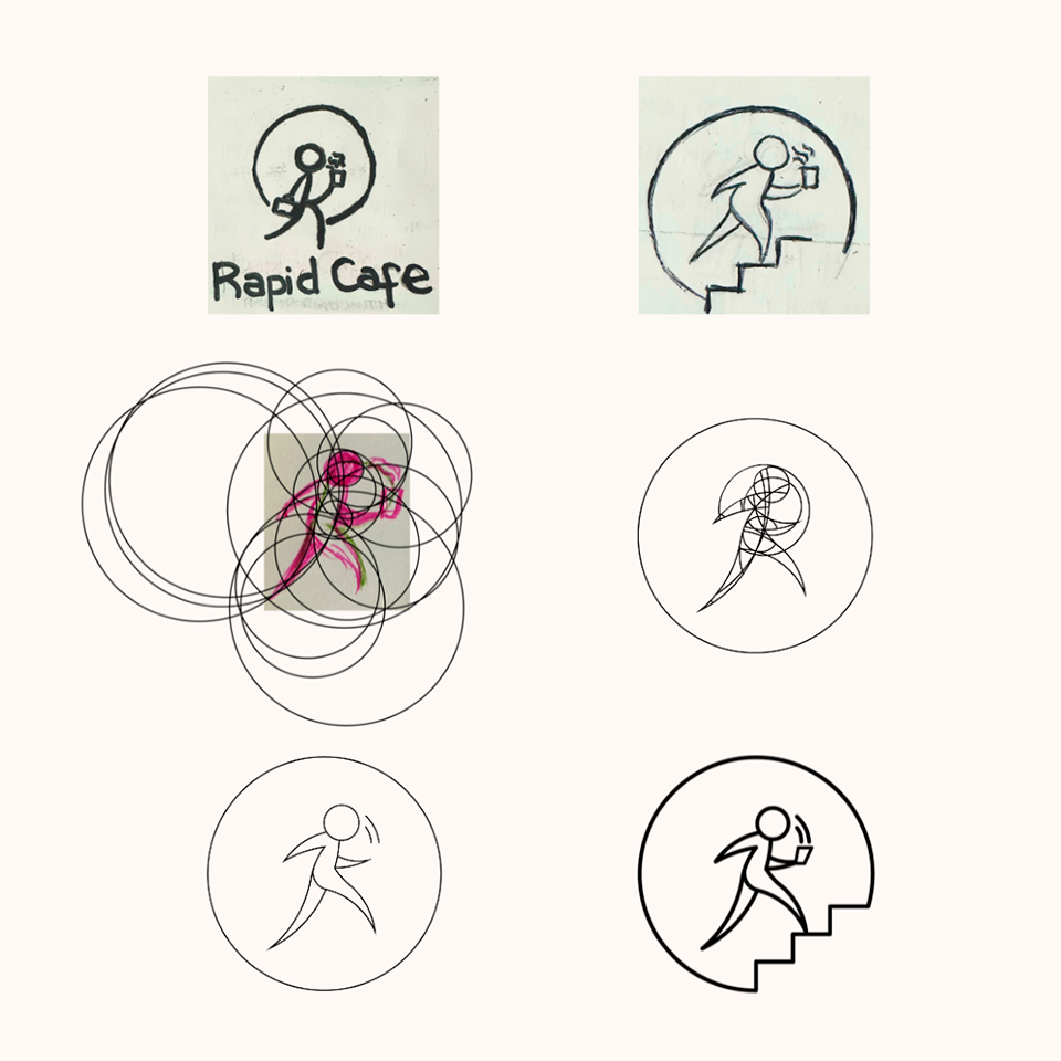
Logo Process
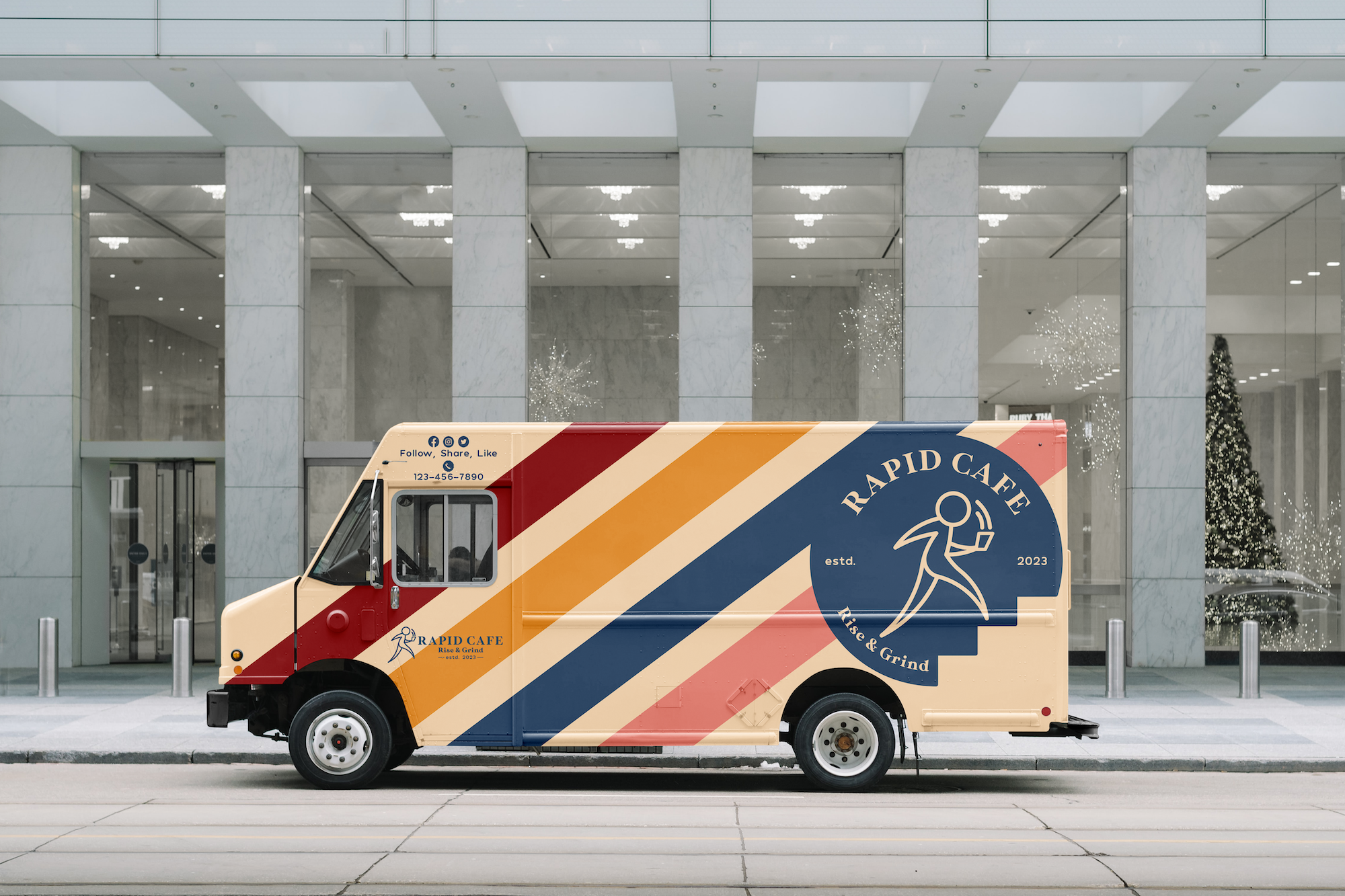
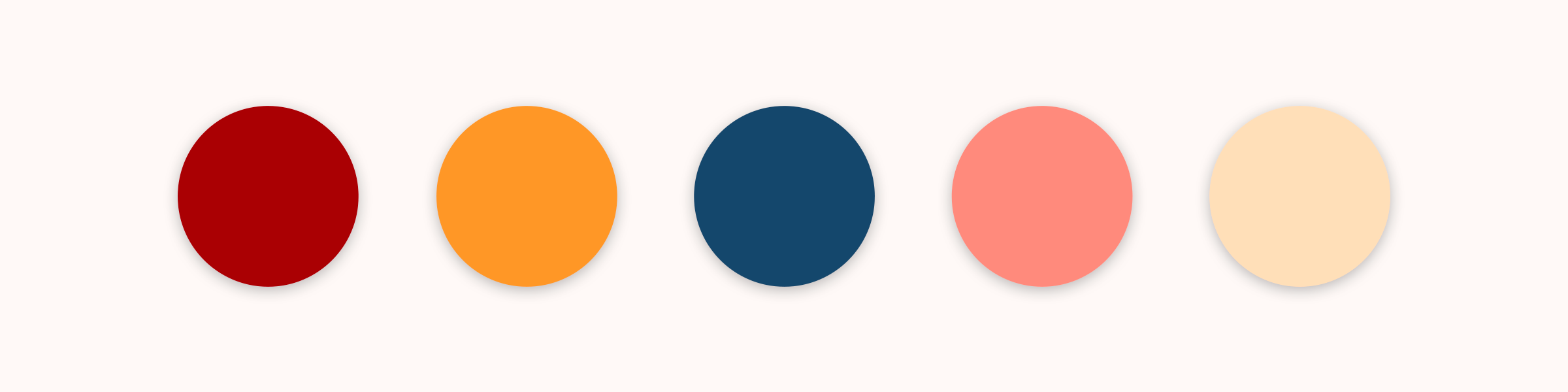
The logo’s concept focuses around its target audience—individuals constantly on-the-go, whether rushing to work or errands. This aligns with the brand’s slogan ‘Rise & Grind’, symbolizing the daily pursuit of goals. The logo features a person in a rush, forming a letter ‘R’ shape that runs parallel to the brand name. The design approach follows a minimalist style, and to enhance cohesion, I adhered to the golden ratio rule using the Fibonacci spiral.